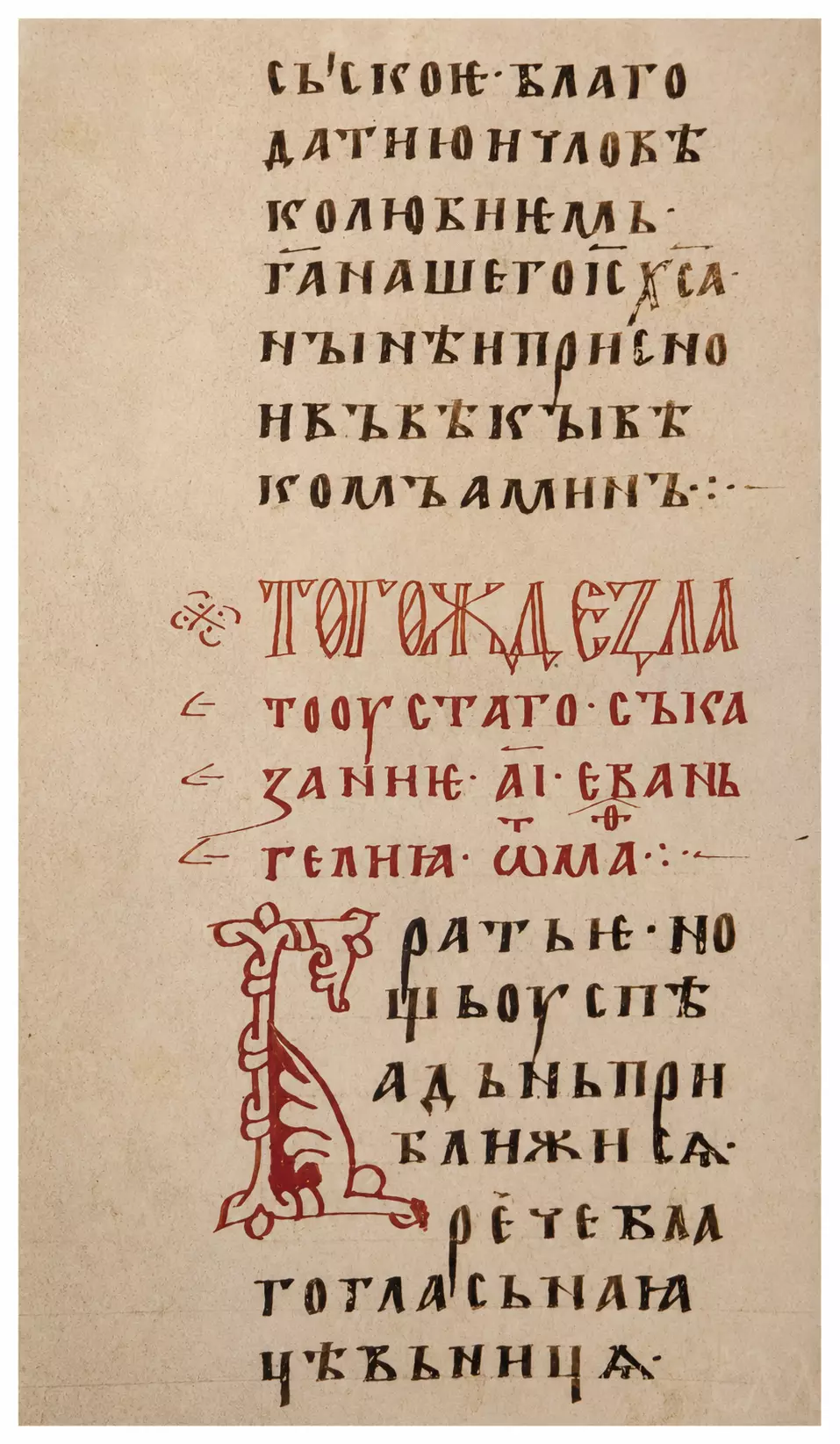
Teaching Gospel Folio 93v of GIM Syn. 262 preserves a particularly clear meeting of text, rubrication, and ornamental script within the Teaching Gospel associated with Constantine of Preslav. Closing one homiletic section, announcing another in cinnabar, then beginning the new discourse with a monumental initial Б, the surviving column makes its visual organisation inseparable from the movement of the text. Dark Cyrillic ustav occupies the upper and lower parts of the parchment, while the broad red heading interrupts the page almost at its centre, allowing the reader to recognise the transition before reading a word.
The manuscript belongs to the Synodal Collection of the State Historical Museum in Moscow. The older catalogue information accompanying the folio dates it to the late twelfth or early thirteenth century and tentatively associates its production with Vladimir or Rostov. More recent scholarship has moved the chronology substantially earlier. The current museum catalogue assigns Syn. 262 to the first quarter of the twelfth century and gives Ancient Rus as its place of production, while the Krivko study discusses palaeographic evidence consistent with the end of the eleventh or beginning of the twelfth century. Krivko also stresses the archaic graphic characteristics of this East Slavonic witness, among them the manuscript’s unusual preservation of the complete repertory of the four yus letters.
Teaching Gospel Folio 93v and the Initial Б
The photographed portion corresponds to column 93c in the scholarly transcription of Syn. 262. Its first lines complete the preceding homily with the conventional doxological formula invoking the grace and loving-kindness of Jesus Christ and ending with Amen. Immediately below comes the cinnabar rubric:
ТОГОЖДЕ ЗЛАТОУСТАГО. съказани .а͠ї. еваньгелиꙗ. ѿ маⷴ⁘
In free English this may be rendered, “Of the same Chrysostom. Exposition of the eleventh Gospel, from Matthew.” The ordinal written with Cyrillic numeral letters beneath a titlo belongs to the manuscript’s system of abbreviation and numerical notation; the contracted form at the end identifies Matthew. In the electronic corpus, the transition can be followed directly: the rubric stands after the closing doxology and before the opening Брать (“Brothers”).
Colour establishes the textual hierarchy with remarkable economy. The principal writing is in a dark brown-black ink, while cinnabar is reserved for the heading and the enlarged opening letter. Iron-gall ink and cinnabar are among the materials recorded for the codex by the State Historical Museum. On this column the contrast remains sharp: across several lines stretches the rubric in narrow, elongated red letterforms; beside the dark text, vertically, descends the initial. The two red elements consequently serve distinct textual functions, the rubric announcing the identity and sequence of the homily, the initial opening its spoken address.
The Б itself extends through roughly seven lines of ordinary writing. Freer in construction than the surrounding ustav, it is built around a long vertical stem articulated by small transverse divisions. The upper part turns outward into looping contours, while below, the form broadens into a filled cinnabar passage before terminating along an extended base. Portions of the interior remain open, preventing the initial from becoming a heavy block of colour. Thin linear ornament, more substantial painted areas, small interruptions in the contour: these changes give the letter an internal rhythm without separating it from the written column. The older catalogue describes the initials of Syn. 262 as belonging to an “Old Byzantine” style, a useful historical classification for the ornamental vocabulary of the manuscript, though by itself it does not establish a connection with any particular Byzantine workshop.
Around this enlarged form the ordinary script remains disciplined. The Cyrillic ustav, with clearly separated letters, relatively upright verticals and controlled changes in width, retains a measured regularity even where the initial presses into the text. Several characters have strongly angular profiles; elsewhere rounded bowls relieve the density of the column. Individual letterforms preserve considerable autonomy, and the spaces between them allow the textual line to be followed when abbreviations and superscript signs interrupt its upper contour.
Those abbreviations are especially significant palaeographically. In the closing doxology, sacred names are contracted beneath titla, including forms for “Lord” and “Jesus Christ.” The rubric similarly compresses “Matthew.” Dots and more elaborate combinations of points divide larger textual units, with the end of Amen receiving visually emphatic punctuation. Above and between the letters runs, in effect, a second graphic register formed by these smaller signs. Page design thus extends well beyond the monumental initial through changes in letter size, pigment, abbreviation and punctuation.
The parchment itself contributes a quieter structure. Its warm surface varies subtly in tone, and faint ruling remains perceptible in parts of the lower area. Along these horizontal guides the writing proceeds with considerable regularity, even beside the large initial, whose irregular contour might otherwise have disturbed the line. Conceived to inhabit the written column rather than a separate ornamental compartment, the letter projects into the text space and obliges the adjoining lines to adjust around it. The result belongs to the same calligraphic architecture as the writing surrounding it.
Content strengthens this relationship between visual threshold and rhetorical beginning. After the red heading, the homily starts: Брать. нощь оуспѣ а дьнь приближи сѧ — “Brothers, the night is far spent, and the day has drawn near” (Romans 13:12). What follows calls the speaker a благогласьнаꙗ цѣвьницѧ, literally a “melodious flute” or “sweet-sounding pipe,” an image whose continuation identifies Paul through the traditional language of the “chosen vessel.” On the following column the exposition proceeds towards the Matthean text, eventually introducing the kingdom of heaven through the image of a king settling accounts with his servants, the opening of the parable of the unforgiving servant (Matthew 18:23–35).
The initial Б, then, gives exceptional visibility to Брать, the direct address to the audience, while the cinnabar rubric above establishes the authority and Gospel sequence of the discourse. Textual divisions acquire a corresponding graphic form. Within a manuscript whose importance lies partly in the survival of an early Slavonic literary tradition, folio 93v preserves that tradition at the level of the individual letter: formal ustav, inherited abbreviation practices, rubrication, an ornamental initial whose scale temporarily alters the rhythm of the written column.
Free Translation of the Visible Text
“…that we may attain the Kingdom of Heaven, by the grace and loving-kindness of our Lord Jesus Christ, now and ever and unto the ages of ages. Amen.
Of the same Chrysostom. Exposition of the eleventh Gospel, from Matthew.
Brothers, ‘the night is far spent, and the day has drawn near’ (Romans 13:12), said the melodious flute…”
The first sentence begins before the surviving portion shown and therefore enters the column already in progress. The final metaphor likewise continues onto column 93d, where its reference to Paul becomes explicit. The transcription of 93c confirms the sequence preserved in the image: closing doxology, rubric, then the opening words of the new discourse.
(The translation was edited by N. Jones.)