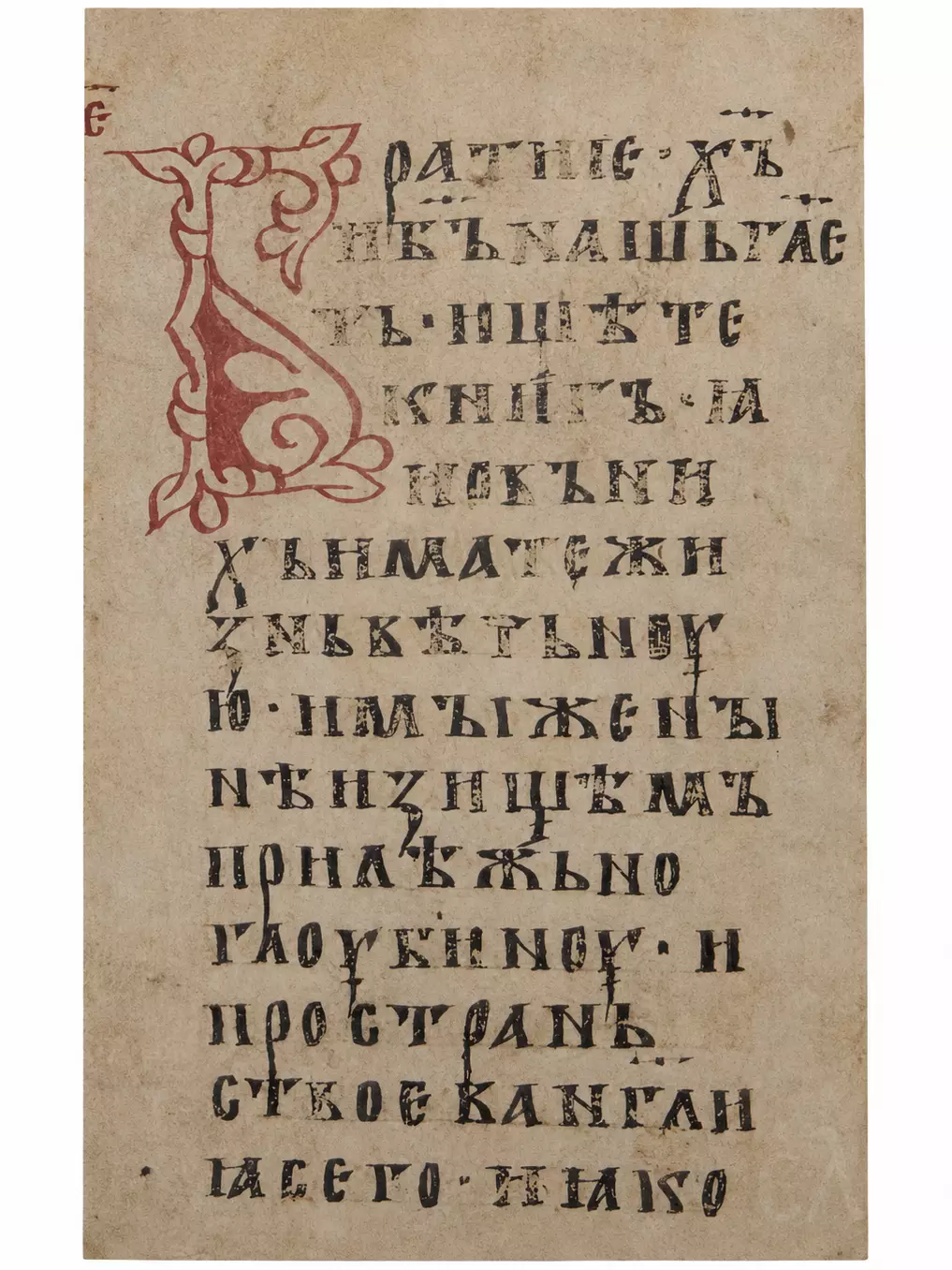
The Teaching Gospel folio 20 of GIM Syn. 262 preserves a striking conjunction of script and ornament: a large cinnabar initial Б opens the address Братие (“Brothers”), while the text proceeds in broad, formal Cyrillic ustav across the parchment column. The manuscript contains the Teaching Gospel associated with Constantine of Preslav, a collection of homiletic material arranged around the Sunday Gospel readings. Folio 20, as the codex moves through one of its early sections, introduces an exposition connected with the Gospel of John. Its decorative force works through a textual function. The enlarged red letter marks a fresh movement in the discourse and gives immediate visual weight to the preacher’s address to his audience.
The catalogue information supplied for the manuscript describes a substantial parchment codex of 264 folios, approximately 38.5 × 29 cm, written in two columns and furnished with cinnabar initials in an “Old Byzantine” style. It traditionally dates the manuscript to the late twelfth or early thirteenth century and tentatively associates its production with Vladimir or Rostov. The chronology has since been reconsidered. Elena Ukhanova’s palaeographical and codicological study proposed the last quarter of the eleventh to the beginning of the twelfth century, while Roman Krivko likewise treats Syn. 262 as an exceptionally archaic East Slavonic witness whose graphic and orthographic features support an earlier dating. The argument can be followed in the Krivko study.
Teaching Gospel Folio 20 and the Cinnabar Initial Б
The initial occupies a substantial part of the left side of the written column. Expansive in relation to the letters beside it, the upright element descends through several lines, while curling extensions open towards the upper and lower margins of the letter. Within the lower body lies a broad area of solid cinnabar, articulated by an inward-turning spiral. Elsewhere the ornament is largely linear, built from narrow bands that turn, fork and terminate in foliate forms. The contrast between outlined and filled areas keeps the initial visually light despite its scale. At the top, the red contour expands laterally before curling back towards the stem; lower down, the filled body broadens and then narrows into a long descending contour. The ornament therefore occupies several lines of writing without forming a separate framed miniature, and its asymmetrical extensions remain closely tied to the vertical movement of the letter.
In this form, the initial belongs comfortably within the manuscript’s documented repertory of cinnabar initials described as being in an “Old Byzantine” style. That designation is best retained as a catalogue classification rather than extended into an assumption about Constantinopolitan manufacture. The ornament uses forms familiar from the wider transmission of Byzantine book decoration into the Slavic world: curved vegetal terminals, ribbon-like contours, an enlarged initial extending beyond the ordinary body of the text. Its execution remains comparatively restrained. There is no gold ground, elaborate figural imagery or independent miniature scene within the letter. Cinnabar alone establishes the principal chromatic hierarchy.
On this folio, that economy matters. The initial Б, which occupies the margin beside the opening line, completes the word Братие. The remaining letters, written immediately to its right in dark ink, return the ornamental form to language. Ornament and reading consequently meet in the same word. First the eye encounters the enlarged red structure; then it resolves the form as the opening consonant of the congregational address, “Brothers”.
Around it the ustav script maintains a markedly different discipline. Letters stand separately and generally upright, with broad proportions and strong verticals. Angular forms alternate with rounded ones without the lateral compression characteristic of many later book hands. The repeated М, Н, Т, Ж and other conspicuous forms produce a measured graphic sequence, though individual strokes vary in thickness and preservation. Some dark letterforms show local abrasion or fading; elsewhere their internal strokes remain sharply legible. Across the parchment, uneven warm tones, small stains and variations in surface texture remain visible within and around the written column.
The first lines also reveal the manuscript’s system of abbreviation. Sacred names appear beneath titla: х͠ъ for Christ and б͠ъ for God, while abbreviated verbal forms likewise employ the superscript sign. Such contractions belong to established Church Slavonic scribal practice, in which the titlo may indicate sacred abbreviations as well as more general suspensions or contractions. Short horizontal superscript marks interrupt the otherwise firmly grounded sequence of upright letters. Punctuation, by comparison, consists of small points and related signs placed within the writing line. These superscript signs and points do more than punctuate the verbal sequence. Visually, they create a secondary layer above and between the heavier letterforms, especially in the opening lines where abbreviations recur. The effect is modest, yet clearly visible against the broad spacing of the ustav.
No chemical analysis of the dark writing ink has been supplied, so its composition should not be inferred from appearance alone. The red decoration, by contrast, is explicitly identified in the manuscript catalogue as cinnabar. Colour on folio 20 consequently has a carefully restricted role: dark ink carries the continuously read text, cinnabar marks the threshold of the new passage.
The manuscript as a whole also complicates the older geographical attribution. The traditional catalogue dating places Syn. 262 at the end of the twelfth or beginning of the thirteenth century, possibly in Vladimir or Rostov. Ukhanova, working from palaeographical and codicological evidence, argued for earlier production in a major scriptorium and identified thirteen scribes participating across the codex. Her conclusions shifted the proposed chronology to the late eleventh or early twelfth century and connected its production with Kyiv. A contemporary scholarly Tihova review of the 2012 edition discusses these arguments and the unusually organised collaborative manufacture implied by the manuscript.
Krivko approached the same question principally through language, graphic practice and orthography. Features characteristic of the oldest East Slavonic manuscript tradition, including the treatment of nasal-vowel signs and other archaic phenomena, occupy an important place in his analysis, which distinguishes the East Slavonic copy from the South Slavonic textual tradition behind it. He also argues that the antecedent from which the text ultimately descends was Cyrillic and belonged to a south-western Balkan milieu. Several historical levels therefore remain visible on the page: Constantine’s early medieval Bulgarian textual inheritance, its transmission through an East Slavonic scribal environment, the visual vocabulary of an early Cyrillic ecclesiastical manuscript.
Folio 20 makes this transmission unusually tangible because its opening is visually emphatic without becoming pictorial. The red Б establishes an ornamental threshold, and what follows is a call to reading. The text begins with an appeal to investigate Scripture (John 5:39), then develops an image of intellectual and spiritual reception through depth, breadth, thirst and rain. What the enlarged initial marks is a passage concerned with the act of penetrating the Gospel text, where visual emphasis and rhetorical beginning coincide through the manuscript’s own organisation.
Free Translation of Folio 20b
Brothers, Christ our God says: “Search the Scriptures, for in them you have eternal life” (John 5:39). Let us now diligently search the depth and breadth of this Gospel, and, like thirsty earth, let us receive the rain of the Gospel into our hearts. For what reason…
The final phrase is incomplete because the sentence continues into the following column. The transcription preserved in the academic corpus confirms the sequence beginning Братие. х͠ъ и б͠ъ нашь г͠летъ. ищѣте книгъ…, followed by the comparison of receptive hearts with thirsty earth receiving “the rain of the Gospel”. The opening citation corresponds to John 5:39, rendered through the inherited Slavonic expression ищѣте книгъ. In a free modern English translation, “Search the Scriptures” conveys its sense more naturally than the literal “search the books”.
Compact and physical, the metaphor that follows urges readers to explore the Gospel in its “depth and breadth”; immediately afterwards, investigation becomes reception, the heart becoming parched ground and the Gospel rain. The ornamental initial prepares this transition without illustrating the metaphor. Its function remains textual, almost architectural, enlarging the point at which the homiletic voice turns outward towards its listeners.
This restraint gives folio 20 much of its character. Dense yet highly ordered, the script supplies the principal visual field; once, decisively, the cinnabar initial interrupts it. Within the history of early Cyrillic book production, the page shows how hierarchy could be created through limited means: scale, colour, line, placement of a single letter. The formal ustav continues beneath and beside it with the authority and legibility expected of a substantial ecclesiastical codex.
(The translation was edited by E. Alexandraki.)